In 2019, AliExpress is focusing on expanding its global presence, particularly in markets where languages are read from right to left (RTL).
RTL stands for right-to-left, which refers to languages like Arabic and Hebrew that are read in this direction. When designing user interfaces for these languages, content should be mirrored to ensure it is understandable.
The main difference between left-to-right (LTR) and right-to-left (RTL) scripts is the direction in which the text is displayed:
• LTR languages: Content is displayed from left to right
• RTL languages: Content is displayed from right to left
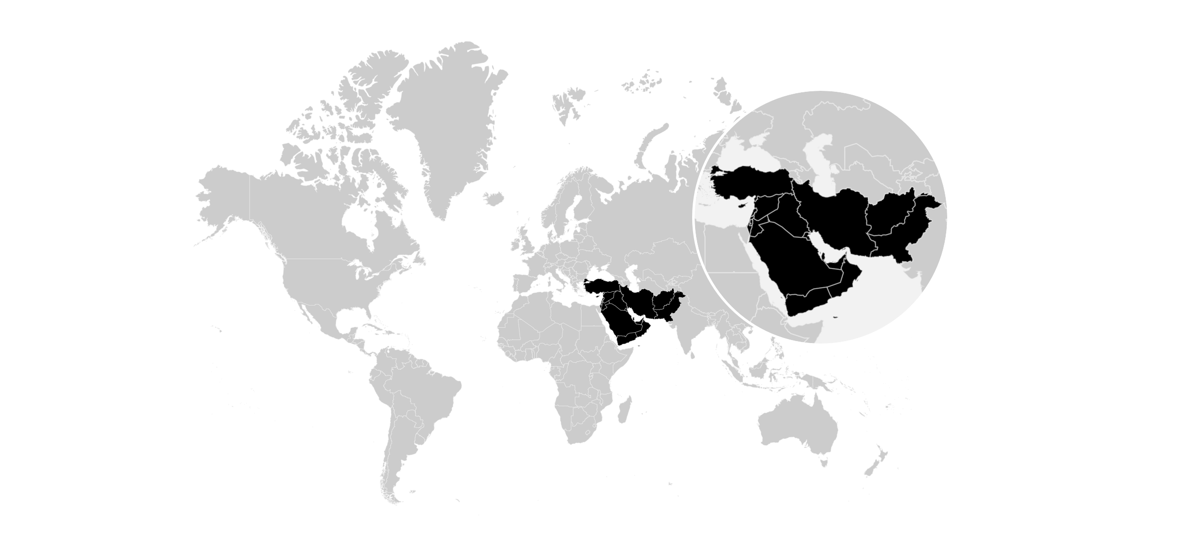
Approximately 400 million people around the world use RTL languages (according to Apple WWDC16, Session 232). Some of the main RTL languages include Arabic, Aramaic, Azeri, Dhivehi, Fula, Hebrew, Kurdish (Sorani), N’ko, Persian, Rohingya, Syriac, and Urdu.
While RTL might not be the first thing that comes to mind in user experience design, these statistics show the significance of creating designs that accommodate RTL users to enhance overall user experience.
RTL languages are prevalent in various countries, mainly located in regions such as Afghanistan, Israel, the Middle East, and Pakistan.
To effectively localize for RTL languages, consider these three major steps:
1. Reverse the sequence for a series of events
2. Translate text and numbers by using localizable labels instead of embedding them into graphics
3. Mirror specific items to align with RTL reading patterns
Translate text wherever possible, but retain brand names like "AliExpress" in their original form. For numbers, refer to a numeral system chart for accurate representation.
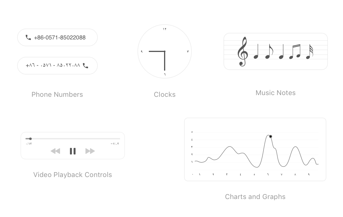
Not all UI elements need to be mirrored when switching from LTR to RTL. Items that should not be mirrored include numerals, phone numbers, clocks, music notes, video playback controls, charts, graphs, images, and non-translated text.
Icons should help users quickly recognize functions or items, regardless of language. Unnecessary mirroring of icons can be counterproductive. Icons should not be mirrored if they are symmetrical, represent real-world objects, or include non-RTL text or symbols.
When using icons in RTL designs, consider cultural sensitivities and ensure they are appropriate for all intended users.
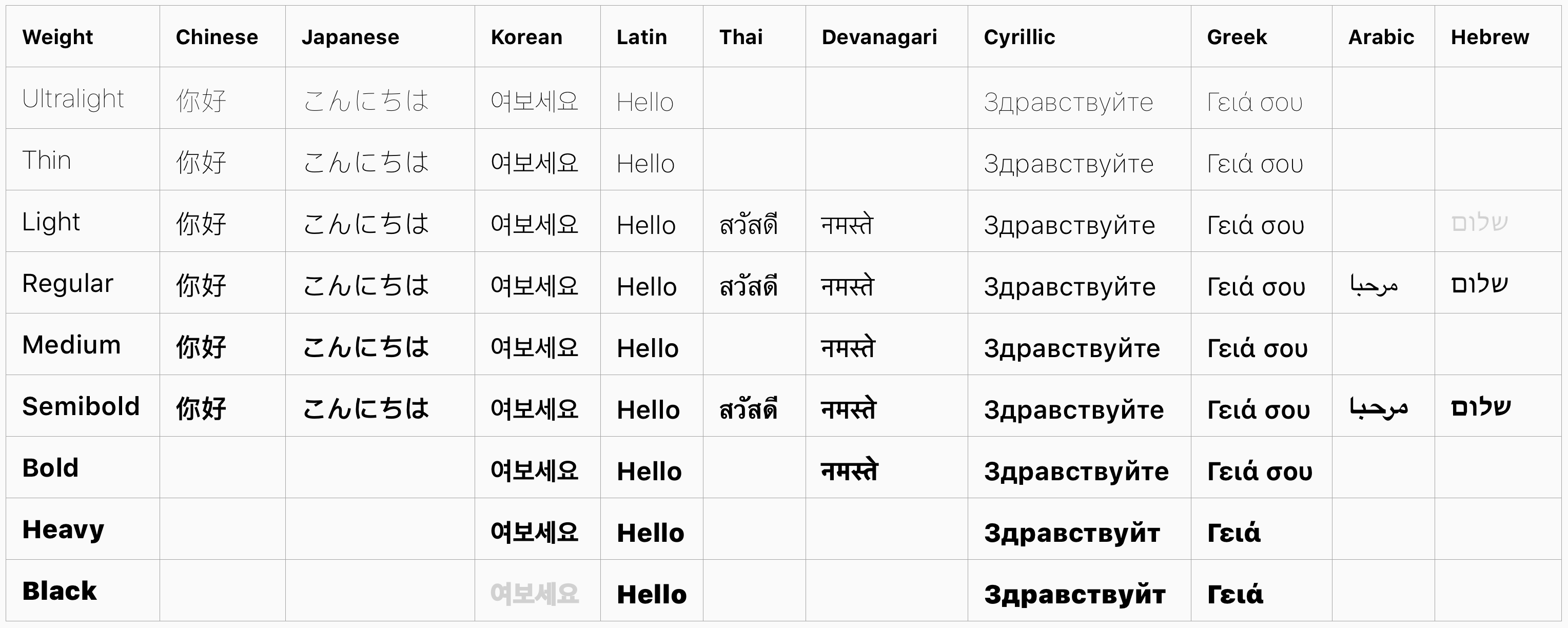
Key considerations for typography include font weight, length, decoration, and line height.
Avoid using bold, italics, or capital letters in most RTL languages, particularly Arabic, as these styles can negatively impact readability. The example below shows how the SF Pro (iOS system font) appears in different scripts.
RTL language words are often shorter than English words, so adjust the layout accordingly to maintain visual balance.
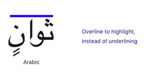
For highlighting text in Arabic, use an overline rather than underlining, interspacing, or italicizing. This approach is demonstrated below:
Adjusting line height for RTL languages can be challenging due to extra marks, like diacritics, which can extend beyond typical line heights. Special care should be taken with Arabic and Hindi fonts, which have deeper descenders compared to Latin characters.
Colors can evoke strong cultural associations. For example, yellow is associated with death in Saudi Arabia, while purple and pink may be less favorable in designs targeting Yemen.
Designing calendars for RTL regions requires special consideration, as the calendar format may differ from those in LTR regions. For example, Arabic calendars are read from right to left, aligning with the language's script.
Input fields should follow the direction of the content. An example of RTL input behavior is shown below:
Below are RTL components designed based on the guidelines outlined above.